Learn to create compelling time series visualizations using Pandas and Matplotlib. Master line plots, area plots, and customization techniques for effective temporal data analysis.
Author
Mohammed Adil Siraju
Published
September 21, 2025
Time series data visualization is crucial for understanding trends, patterns, and changes over time. This notebook covers:
Creating Time Series Data: Using datetime indices and ranges
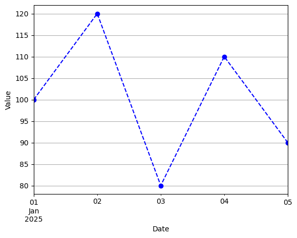
Basic Line Plots: Essential time series visualization
Plot Customization: Colors, markers, styles, and labels
DataFrame Visualization: Plotting multiple series
Best Practices: Making your time series plots clear and informative
Effective visualization helps you communicate temporal patterns and insights from your data.
1. Creating Time Series Data
Let’s start by creating time series data using Pandas’ powerful datetime capabilities.
Creating a Time Series with DateTime Index
Use pd.date_range() to create a sequence of dates, then create a Series with datetime index: