Data Viz with pandas tools

pandas
dataframe
data-visualisation
Quick examples of plotting with pandas and matplotlib (line, bar, scatter) and visualization best practices.
Author

Mohammed Adil Siraju

Published

September 23, 2025

Data Visualization with pandas tools

This notebook shows simple, reusable examples of creating line, bar, and scatter charts directly from pandas using matplotlib as the backend. Each section includes a short explanation and code snippet.

# Import libraries and create sample DataFrame
import pandas as pd
import matplotlib.pyplot as plt
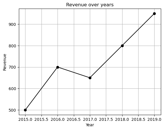
data = {
    'Year': [2015,2016,2017,2018,2019],
    'Revenue': [500,700,650,800,950]
}

df = pd.DataFrame(data)
df
Year Revenue
0 2015 500
1 2016 700
2 2017 650
3 2018 800
4 2019 950
df.plot(x='Year', y='Revenue', kind='line', marker='o', color='black', legend=False)
plt.title('Revenue over years')
plt.xlabel('Year')
plt.ylabel('Revenue')
plt.grid()
plt.show()

Line Chart: Revenue over Years

Line charts are useful for showing trends over time. Use pandas’ DataFrame.plot(kind='line') for quick exploration.

# Bar chart example data
data = {
    'City': ['New York', 'London', 'Tokyo', 'Sydney', 'Paris'],
    'Population': [850000, 890000, 900000, 520000, 1100000]
}

df_cities = pd.DataFrame(data)
df_cities
City Population
0 New York 850000
1 London 890000
2 Tokyo 900000
3 Sydney 520000
4 Paris 1100000
# Bar chart (sorted by population)
df_cities.sort_values(by='Population', ascending=False).plot(x='City', y='Population', kind='bar', color='tab:red', legend=False)
plt.title('Population in Major Cities')
plt.xlabel('City')
plt.ylabel('Population')
plt.tight_layout()
plt.show()

Scatter Plot: Relationship between X and Y

Scatter plots are useful to visualize relationships between two numeric variables. Use plt.scatter or DataFrame.plot(kind='scatter').

# Scatter data
df_scatter = pd.DataFrame({'X': [1, 2, 3, 4, 5], 'Y': [2, 3, 4, 8, 10]})
df_scatter
X Y
0 1 2
1 2 3
2 3 4
3 4 8
4 5 10
# Scatter plot
plt.scatter(df_scatter['X'], df_scatter['Y'], color='g')
plt.title('Scatter: X vs Y')
plt.xlabel('X')
plt.ylabel('Y')
plt.grid(alpha=0.3)
plt.show()

Best Practices

  • Use descriptive titles and axis labels.
  • Prefer plt.tight_layout() after plotting to avoid overlap in labels.
  • For large datasets, consider sampling or using alpha blending (alpha) to avoid over-plotting.
  • Use color palettes from matplotlib or seaborn for consistent visuals.

Summary

This notebook provided quick examples of line, bar, and scatter charts using pandas + matplotlib. Use these snippets as a starting point for exploratory data analysis and adapt styling as needed.